gptstudio R package Setup Guide
The goal of gptstudio is for R programmers to easily incorporate use of large language models (LLMs) into their project workflows. These models appear to be a step change in our use of text for knowledge work, but you should carefully consider ethical implications of using these models. Ethics of LLMs (also called Foundation Models) is an area of very active discussion.
Here is the readme for the gptstudio package. Here is the R markdown file used in this guide
Our goal is to use gptstudio to write and improve code by chatting:

Step 1: Setup OpenAI Key + Rstudio
- Make an OpenAI account
- Follow this link to create an OpenAI API key
- Create a Project in R Rstudio. Open that project and work within it.
- Make an Rmarkdown file and Install gptstudio package (and tidyverse while we are at it) using the following code chunk:
 ## clear workspace
 rm(list=ls())

 ## Load Packages
 load.lib<-c("gptstudio","tidyverse") # List of required packages
 install.lib <- load.lib[!load.lib %in% installed.packages()] # Select missing packages
 for(lib in install.lib) install.packages(lib,dependencies=TRUE) # Install missing packages + dependencies
 sapply(load.lib,require,character=TRUE) # Load all packages.
- Setup your API key in the RStudio Project by opening the .Renviron file for your project. I ended this text directly into the console.
require(usethis)
edit_r_environ(scope="project")
- Add this line to the .Renviron file (replacing
with your key, keeping the quotes):
OPENAI_API_KEY= "<APIKEY>"
- Close the popup. You may have to restart RStudio fore proceeding.
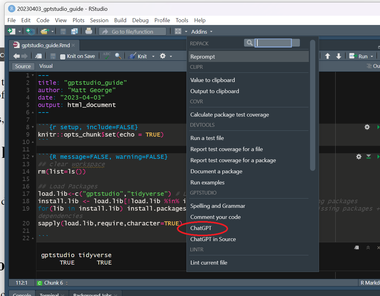
Step 1: Use the ChatGPT shiny app to generate a plot
Now that you are all set up, navigate to the ChatGPT shiny app by going to the Addins dropdown menu and selecting ChatGPT
Within the shiny app, give it the following prompt:
Write some R code that makes a scatterplot of Pepal.Length across Setal.Length using the iris dataset
Here is what it looked like:
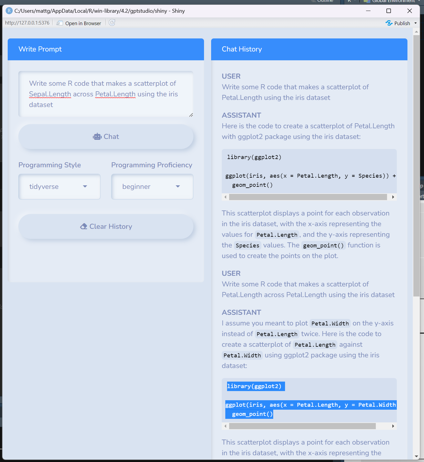
Here was the output:
ggplot(iris, aes(x = Sepal.Length, y = Petal.Length)) + geom_point()
Step 2: Use the ChatGPT in Source to improve the plot
Now lets improve the plot that we generated in the shiny app. You can do this by adding the code to an R chunk in the RMD file, adding a comment next to the code you want improved, highlighting it, and selecting the ChatGPT in source option from the Addins menu.
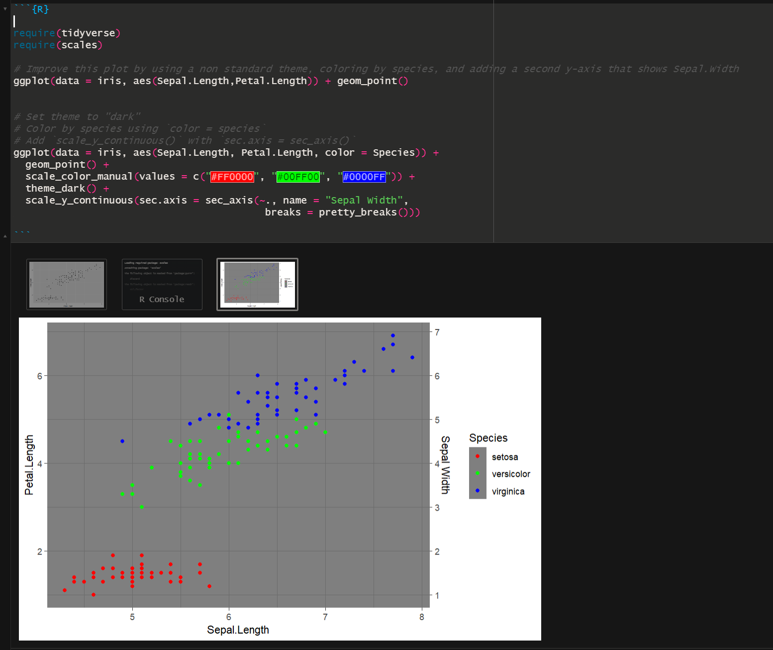
# Improve this plot by using a non standard theme, coloring by species, and adding a second y-axis that shows Sepal.Width
ggplot(data = iris,aes(Sepal.Length,Petal.Length)) + geom_point()
Here is what is looks like to run it:
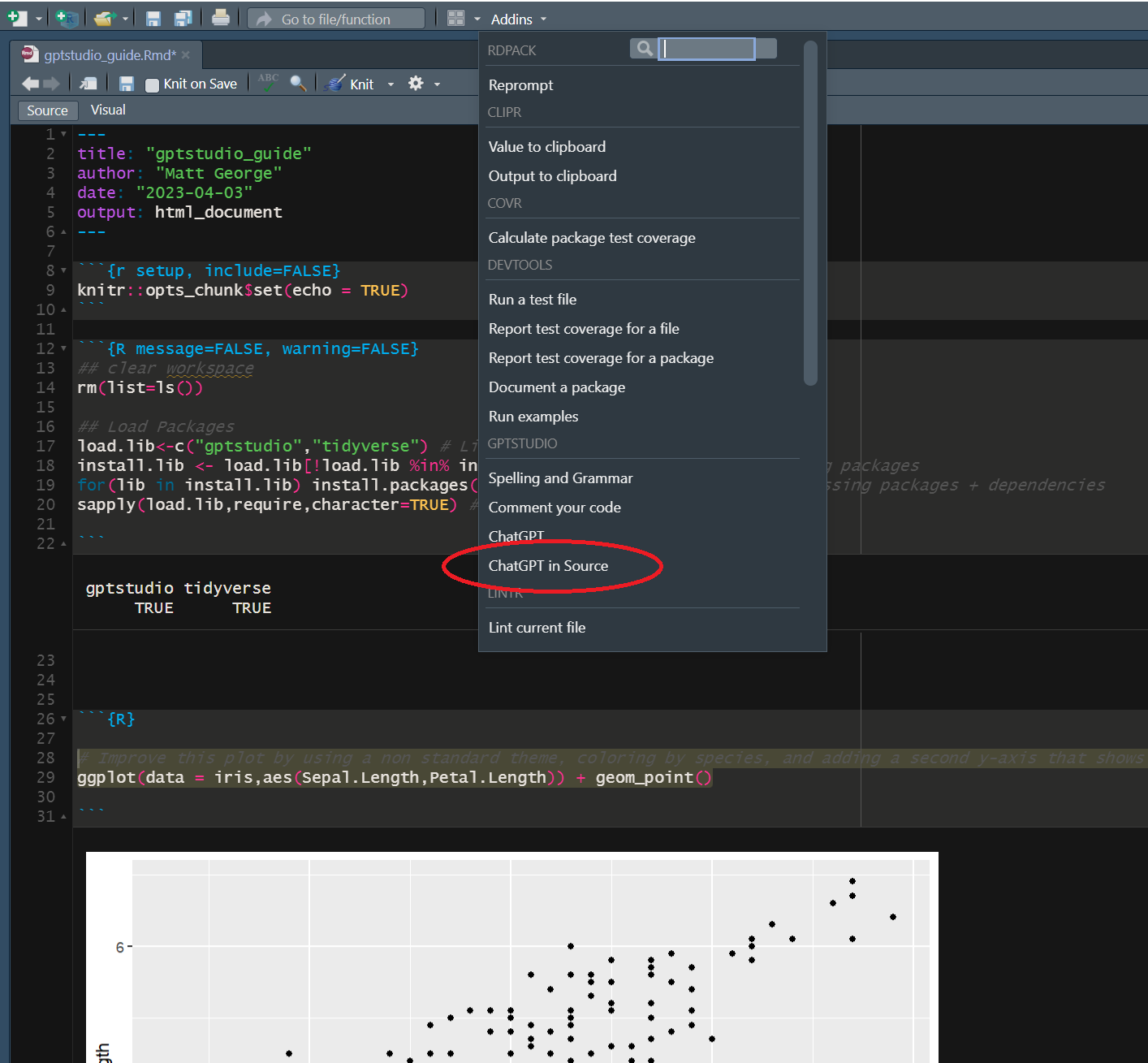
and here is the results:
require(tidyverse)
require(scales)

# Improve this plot by using a non standard theme, coloring by species, and adding a second y-axis that shows Sepal.Width
ggplot(data = iris, aes(Sepal.Length,Petal.Length)) + geom_point()

# Result:
# Set theme to "dark"
# Color by species using `color = species`
# Add `scale_y_continuous()` with `sec.axis = sec_axis()`
ggplot(data = iris, aes(Sepal.Length, Petal.Length, color = Species)) +
  geom_point() +
  scale_color_manual(values = c("#FF0000", "#00FF00", "#0000FF")) +
  theme_dark() +
  scale_y_continuous(sec.axis = sec_axis(~., name = "Sepal Width",
                                          breaks = pretty_breaks()))
To get this to work, I had to find where pretty_breaks came from. Installing and requiring the scales package fixed the issue and I was able to run it.
Here is what it looks like:
Round 2: Let’s keep going!
Input:
# Improve this plot by removing gridlines, setting the minimum of each y axis to zero, make the plot background white, increase the size of points, add a linear regression that plots relationship between Sepal.Length and Petal.Length across all species, and add R-squared value for linear regression to the plot.
ggplot(data = iris, aes(Sepal.Length, Petal.Length, color = Species)) +
  geom_point() +
  scale_color_manual(values = c("#FF0000", "#00FF00", "#0000FF")) +
  theme_dark() +
  scale_y_continuous(sec.axis = sec_axis(~., name = "Sepal Width",
                                          breaks = pretty_breaks()))
Output:
# Solution:
# Add the following code to the existing code:
# Remove gridlines
# Set minimum of y-axis to zero
# Set the plot background to white
# Increase size of points
# Add linear regression line and R-squared value
ggplot(data = iris, aes(Sepal.Length, Petal.Length, color = Species)) +
  geom_point(size = 4) +
  scale_color_manual(values = c("#FF0000", "#00FF00", "#0000FF")) +
  theme_light() +  # Change theme to light
  scale_y_continuous(limits = c(0, NA), sec.axis = sec_axis(~., name = "Sepal Width",
                                          breaks = pretty_breaks())) +  # Change y axis limit
  theme(panel.grid = element_blank(),  # Remove gridlines
        plot.background = element_rect(fill = "white")) +  # Set plot background to white
  geom_smooth(method = "lm", formula = y ~ x,  # Add linear regression line
              aes(group = 1), se = FALSE) +
  stat_poly_eq(formula = y ~ x, aes(label = paste(..eq.label.., ..rr.label.., sep="~~~")),
               parse = TRUE, label.x.npc = "right", label.y.npc = 0.9)  # Add R-squared value for linear regression.
However, I got this error when running it:
Error in stat_poly_eq(formula = y ~ x, aes(label = paste(..eq.label..,  :
  could not find function "stat_poly_eq"
It looks like it failed to note that the ggpmisc package was required for stat_poly_eq. I installed it and ran it again and got this:
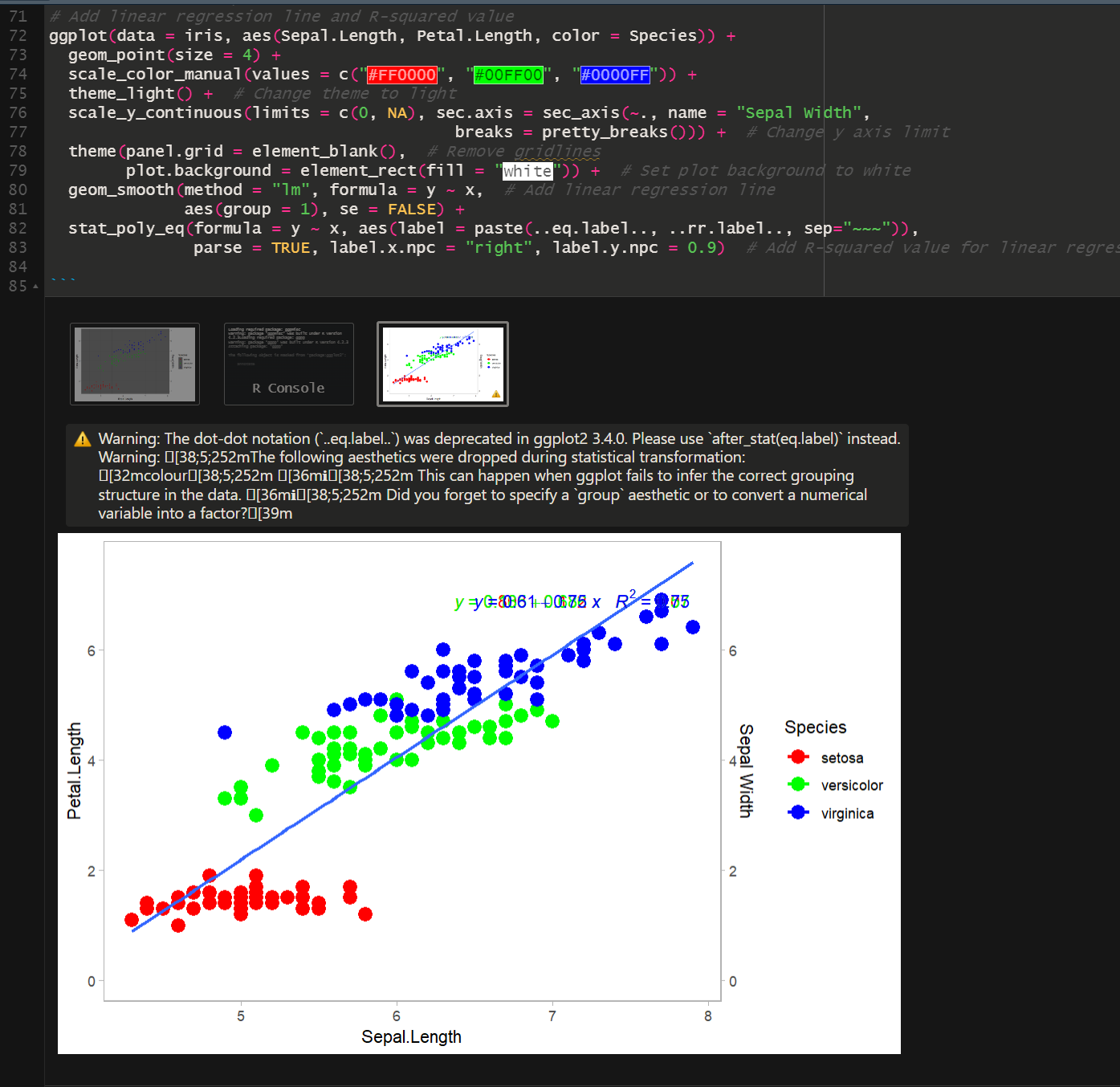
The plot still doesn’t look right. The code overlays the whole equation for the regression line and placed it in the upper right hand corner. Let’s ask it to fix it.
And Round 3 (I added the suggestions as a list this time)
# Improve this plot by:
# 1. Change the color of the points to three different hues of purple
# 2. Make the axis labels and axis values larger
# 3. Make the border and axis lines thicker
# 4. Move the output of stat_poly_eq to the top left quadrant of the graph
# 5. Make the regression line black; make sure it appears behind the data points
# 6. Do not paste the equation of the linear regression, just add the R-square value


ggplot(data = iris, aes(Sepal.Length, Petal.Length, color = Species)) +
  geom_point(size = 4) +
  scale_color_manual(values = c("#FF0000", "#00FF00", "#0000FF")) +
  theme_light() +  # Change theme to light
  scale_y_continuous(limits = c(0, NA), sec.axis = sec_axis(~., name = "Sepal Width",
                                          breaks = pretty_breaks())) +  # Change y axis limit
  theme(panel.grid = element_blank(),  # Remove gridlines
        plot.background = element_rect(fill = "white")) +  # Set plot background to white
  geom_smooth(method = "lm", formula = y ~ x,  # Add linear regression line
              aes(group = 1), se = FALSE) +
  stat_poly_eq(formula = y ~ x, aes(label = paste(..eq.label.., ..rr.label.., sep="~~~")),
               parse = TRUE, label.x.npc = "right", label.y.npc = 0.9)  # Add R-squared value for linear regression.
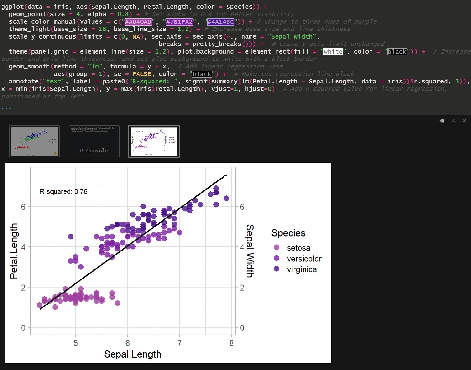
The output, with pretty purple hues!
ggplot(data = iris, aes(Sepal.Length, Petal.Length, color = Species)) +
  geom_point(size = 4, alpha = 0.8) + # Set alpha to 0.8 for better visibility
  scale_color_manual(values = c("#A040A0", "#7B1FA2", "#4A148C")) + # Change to three hues of purple
  theme_light(base_size = 16, base_line_size = 1.2) + # Increase base size and line thickness
  scale_y_continuous(limits = c(0, NA), sec.axis = sec_axis(~., name = "Sepal Width",
                                          breaks = pretty_breaks())) +  # Leave y axis limit unchanged
  theme(panel.grid = element_line(size = 1.2), plot.background = element_rect(fill = "white", color = "black")) +  # Increase border and grid line thickness, and set plot background to white with a black border
  geom_smooth(method = "lm", formula = y ~ x,  # Add linear regression line
              aes(group = 1), se = FALSE, color = "black") +  # Make the regression line black
  annotate("text", label = paste0("R-squared: ", signif(summary(lm(Petal.Length ~ Sepal.Length, data = iris))$r.squared, 3)), x = min(iris$Sepal.Length), y = max(iris$Petal.Length), vjust=1, hjust=0)  # Add R-squared value for linear regression, positioned at top left